A Brief Introduction to Spatial Analysis in R
Charles DiMaggio
See these more thorough overviews:
- Roger Bivand - very highly recommended, and the basis for much of my material
- notes and tutorial
- chapter on spatial mapping of overdose deaths
- course exercise
Let’s wade right in…
first steps
- install and load sp and maps
- load the meuse data set
- examine the structure of meuse
- dataframe, 155 observations, 14 variables
- x and y are map coordinates
plotting the meuse data
SpatialPointsDataFrame object
- spatially-referenced points with attribute data
- sp:coordinates() will convert R dataframe to SpatialPointsDataFrame
categorize and plot flood frequencies
working with spatial objects
- Spatial objects are S4 objects
- note in str() output, uses the *@* convention
- e.g. names(meuse@data)
- some special spatial tools, e.g select.spatial() to identify points
- select.spatial(meuse)
- click three points to surround (don’t have to completely surround)
- R click to return point data
- generic plot() return spatially-referenced results, e.g plot()
- …but special spatial plots are available
coordinate reference systems
- definitions for the location of a point on the earth
- reference ellipsoid - defines shape of the earth
- datum - reference point(s) on earth’s surface
- unit of measurment, e.g. meters, miles
- projection - how spherical earth projected onto 2 dimensions
- equirectangular
- cylindrical or Mercator’s
- conical
Example CRF
- meuse coordinates referenced to Netherlands RDH topographical convention
- sp:proj4string() uses rgdal library to specify a CRS
- sp:spTransform() will change from one CRS to another
- e.g.
Why map?
- Just because you can doesn’t mean you should
- text for a few numbers
- table for many numbers
- plots for relationships
- maps for patterns in space and time…
The greatest map?
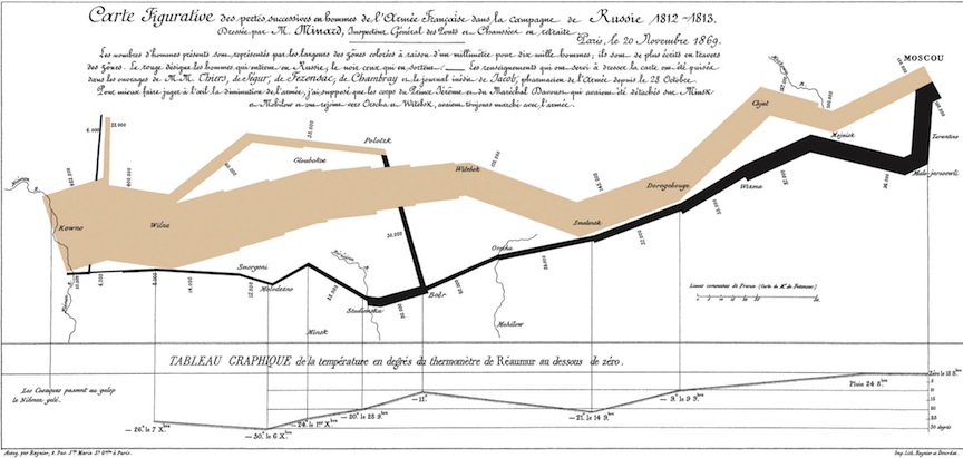
Minard’s Map of Napolean’s Russian Campaign of 1812
The greatest map
- Edward Tufte might say yes
- enormous amount of data laid out in organized, understandable fashion
- multi-media presentations of lines, numbers, pictures, narrative
- no proprietary platform, easily accessible by multiple users
- entirely content, e.g. no drop shadows, bullet indents etc…
- genuinely interactive (people instinctively look for familiar areas, etc…)
Minard’s Map Illustrates 6 principals (6 C’s) of analytic design and mapping (from Tufte)
- comparisons, contrasts and differences
- pre-post troop levels illustrated at beginning and end (started with 400K, ended with 10K)
- causality and connections
- path of retreating army tied to a temperature scale at bottom
- complexity and multivariate data
- six dimensions of data on the map: size of the army, location in lat and long, direction, temperature, places
- cleverness, and innovative methods (use ‘whatever it takes’ to explain something)
- map is annotated all over with numbers and words
- credibility, by documenting the source of your data
- two paragraphs at top are about sourcing and detail
- content is king, tell a compelling story, ultimately stand or fall on the quality, integrity and relevance of your content
- Minard’s map is essentially an anti-war poster telling a compelling story
Spatial Analysis
- See online presentation by Dave Unwin
- location as an explanatory variable
- patterns in space, e.g. clustering
- spatially varying risk
- geographic or local covariates
- spatial data have additional structure
- morphology - point, line, areal
- geography - lat/long, CRS
- attributes - elevation, population, measurements
R and Spatial Analysis
- familiar, unifying analytic environment
- many specialized packages and functions available
- ability to translate most any spatial data
- rapidly incorporate advances
- growing, almost invariably supportive community
R spatial data
- spatial data frame - fundamental spatial R object
- translates Cartesian coordinates to geography
- 3 important attributes
- x/y become lat/long
- Coordinate Reference System (CRS) relates lat/long to earth
- “bounding box” to display the data
R spatial packages
- “base” packages - sp, maptools, rgdal
- useful utilities to read in, transform, display, manipulate spatial data
- spatial statistics - gstat, geoR, spBayes
- areal data - spdep, DCluster, ade4, SpatialEpi
- point pattern data - spatial, splancs. spatstat
3 Basic Applications
- areal (or lattice) data
- is there spatial variation?
- if so, does pattern of spatial variation help explain why?
- point pattern data
- are there clusters?
- if so, does pattern help explain why?
- spatial interpolation
- convert discrete observations to continuous fields
- is the variable actually continuous, e.g. elevation, rain fall, temperature?
- given a sample, what is the value at some non-measured location?
Areal Data: Suicide Mortality in 32 London Boroughs 1989-1993
data from Congdon (2007) via Blangiardoa et al (2013)
read in data
library(maptools)
library(spdep)

london<-readShapePoly(" ~ download ~ /LDNSuicides")
plot(london) ## NB: no CRS
class(london)
names(london)
london$NAME

obs=c(75,145,99,168,152,173,152,169,130,117,124,119,134,90,
    98,89,128,145,130,69,246,166,95,135,98,97,202,75,100,
    100,153,194) ## observerd number suicides each london borough
exp=c(80.7,169.8,123.2,139.5,169.1,107.2,179.8,160.4,147.5,
    116.8,102.8,91.8,119.6,114.8,131.1,136.1,116.6,98.5,
    88.8,79.8,144.9,134.7,98.9,118.6,130.6,96.1,127.1,97.7,
88.5,121.4,156.8,114) ## expected number suicides each london borough- create dataframe of borough names, observed, expected
- data is in alphabetical order, so have to sort the names from the spatial dataframe
- calculate crude and empirical Bayes smoothed SMRS
- NB: spdep tool probmap() calculates SMRs using population numbers
map the results
- reorder data file to match order in the spatial file
- establish and apply cut off values to categorize
- merge the smrs to spatial dataframe by name
- spplot to map
cuts<- c(0.6, 0.9, 1.0, 1.1,  1.8)
suicide.dat$SMR.cut<-cut(suicide.dat$SMR,breaks=cuts,include.lowest=TRUE)
suicide.dat$smooth.cut<-cut(suicide.dat$smooth,breaks=cuts,include.lowest=TRUE)
attr(london,"data")<-merge(data.london,suicide.dat,by="NAME")

spplot(london, c("SMR.cut", "smooth.cut"),col.regions=gray(3.5:0.5/4),main="")- NB: Never use crude SMRS
- In this example crude SMR’s are very close to smoothed
- But this will generally not be so
- crude SMRs are notoriously unstable and can be misleading…
Point Process Data: Broad Street Pump Cholera Outbreak
- What if John Snow had R?
load packages, read data (with rgdal), plot
- data from [Robin T. Wilson] (http://blog.rtwilson.com/john-snows-cholera-data-in-more-formats/)
- GDAL - geospatial data abstraction library
- installation something of a bear…
plot with background image
plot the point process with spatstat
- convert sp to ppp
- summarize and simple plot
- plot density comparing 2 bandwidths
- overlay pump sites
- perspective plots
- theta= option for view
cholera.point<-as.ppp(cholera)
summary(cholera.point)
plot(cholera.point)

plot(density(cholera.point,20))
plot(density(cholera.point,30))
plot(pumps, add=T, col="red", pch=10, cex=3)


persp(density(cholera.point,30))
persp(density(cholera.point,30), theta=90)
persp(density(cholera.point,30), theta=180)
Riply’s K statistic
- solid black line is observed K function
- dashed blue is expected
Spatial Interpolation
- Inverse Distance Weighting (IDW)
- use neighboring samples to estimate every location on fine grid
- gstat package - option “e=” controls degree of smoothing
- results in ring contour lines
- close to what surveyor might draw
- but can’t assess error to externally validate
- choice of smoothing exponent essentially arbitrary
- clustered samples affect outcome
- variograms
- estimate dependence between two points in space
- distance on x-axis, semivariance on y axis
- use to improve interpolations
- kriging
- interpolation technique
- incorporate variance for error estimates