
Conducting Web-based Research in R
Web Scraping
Example: Distribution of Ideology in the US House of Representatives
Example: Papal Survival
Analyzing Twitter Data
We live in an information age, and much of the information is online. Epidemiologists are being challenged “Harness the Web” and make good public health use of that information and R can help smooth the way.
Web Scraping
Web scraping refers to extracting data elements from webpages. I adapted this little tutorial from a blog post I came across on R bloggers. The poster apparently prefers anonymity. The example uses the XML package, but there are other packages like RCurl and scrapeR with additional or different capabilities.
Extracting a Single, Simple Table
We begin by extracting a simple HTML table from a website. The Safe Routes to School Program in the US allocates federal money to encourage children to walk and bike to school. The money is spent on changes to the built environment to make such activity safer. This online table documents state allocations. You could, of course, try to cut and paste it into a document or analysis program, but R has tools to directly extract the data.
The first step is to load the “XML” package, then use the htmlParse() function to read the html document into an R object, and readHTMLTable() to read the table(s) in the document. The length() function indicates there is a single table in the document, simplifying our work.
1 2 3 4 5 6 | library(XML) srts<-htmlParse("http://apps.saferoutesinfo.org/legislation_funding /state_apportionment.cfm") class(srts) srts.table<- readHTMLTable(srts,stringsAsFactors = FALSE) |
That actually does it for the specicalized “webscraping” tools. The next steps involve processing the table into a usable format. This involves removing all the commas, and the leading dollar signs, renaming the variables, replacing the state names which were removed during the processing, and finally (because my OCD demands it), movign the state names to the first column.
1 2 3 4 5 6 7 8 9 | money <- sapply(srts.table[[1]][,-1], FUN= function(x) as.character(gsub(",", "", as.character(x), fixed = TRUE) )) money<-as.data.frame(substring(money,2), stringsAsFactors=FALSE) names(money)<-c("Actual.05","Actual.06","Actual.07","Actual.08", "Actual.09","Actual.10","Actual.11", "Actual.12", "total") money$state<-srts.table[[1]][,1] money<-money[,c(10,1:9)] money |
At this point, you can treat and analyze the table as you would any R data frame. For example, let’s what the top 5 states were in terms of total and relative allocations.
1 2 3 4 | top5<-money[rev(order(as.numeric(money$total))),] top5[2:6, c(1,10)] plot(money$total[1:51], type="h") |
A More Complicated Table
This is all nice enough, but let’s take on something a bit meatier. Perhaps not so easily amenable to simple cut and paste. How about every individual SRTS project in the US down to the local level? You can find that page here
Let’s go through the process of reading in the larger, more complicated file.
1 2 | projects<-htmlParse("http://apps.saferoutesinfo.org/project_list/results.cfm") projects.table<- readHTMLTable(projects,stringsAsFactors = FALSE) |
Done.
What were the 5 highest average expenditures per project by state?
1 2 3 4 5 6 7 8 9 10 11 12 13 14 | str(projects.table) expenditures<-data.frame(cbind(projects.table[[1]][1],projects.table[[1]][3])) expenditures$Award.Amount<-gsub(",", "", as.character(expenditures$Award.Amount), fixed = TRUE) expenditures$Award.Amount<-as.numeric(substring(expenditures$Award.Amount,2)) expenditures$Award.Amount[1:5] aggregate( . ~ State, FUN=function(Award.Amount) c(u=mean(Award.Amount), sd=sd(Award.Amount)), data=expenditures) top5<-aggregate(Award.Amount~State, data=expenditures, FUN=mean) str(top5) top5<-top5[rev(order(top5$Award.Amount)),] top5[1:5,] |
Pages With Multiple Tables
Till now, there has only been one table on a page. You will likely come across pages with multiple pages. The most straightforward way to extract the table in which you are interested is to run through the index of the list objects. Here is an example looking at a page with information about tornado fatalities from the US CDC that has three tables on it.
1 2 3 4 5 6 7 8 9 10 11 12 13 | tornados<-htmlParse("http://www.cdc.gov/mmwr/preview/mmwrhtml /mm6128a3.htm?s_cid=mm6128a3_e%0d%0a") tornado.tables<- readHTMLTable(tornados,stringsAsFactors = FALSE) length(tornado.tables) head(tornado.tables[[1]]) tail(tornado.tables[[1]]) head(tornado.tables[[2]]) tail(tornado.tables[[2]]) head(tornado.tables[[3]]) tail(tornado.tables[[3]]) |
If you come across a page with many tables, you may be interested in a little loop to do this work for you, which you can find here.
Example: Distribution of Ideology in the US House of Representatives
Another, more complex, example from the is.R() blog illustrating three things here, (1) downloading data from web, (2), using plyr to slice and dice the data, and (3) creating a very cool graphic.
You will be using the packages plyr, foreign, Hmisc, and ggplot2, so begin by making sure you have them installed.
1 | lapply(c("plyr", "foreign", "Hmisc", "ggplot2"), library, character.only=T) |
Use the read.dta() function in the Hmisc package to read a Stata file with US Congressional vote data
1 | dwNominate <- read.dta("ftp://voteview.com/junkord/HL01111E21_PRES.DTA") |
Recode the party variable.
1 2 3 4 | dwNominate$majorParty <- "Other" dwNominate$majorParty[dwNominate$party == 100] <- "Democrat" dwNominate$majorParty[dwNominate$party == 200] <- "Republican" head(dwNominate) |
Use plyr and functions from Hmis to aggregate and summarize the data. Note, the last little bit of code .progress=“text”, is just to monitor the progress of the work.
1 2 3 4 5 6 7 8 9 10 | aggregatedIdeology <- ddply(.data = dwNominate, .variables = .(cong, majorParty), .fun = summarise, # Allows the following: Median = wtd.quantile(dwnom1, 1/bootse1, 1/2), q25 = wtd.quantile(dwnom1, 1/bootse1, 1/4), q75 = wtd.quantile(dwnom1, 1/bootse1, 3/4), q05 = wtd.quantile(dwnom1, 1/bootse1, 1/20), q95 = wtd.quantile(dwnom1, 1/bootse1, 19/20), N = length(dwnom1), .progress = "text") |
Process the party variable and look at the cross tabulations.
1 2 3 | aggregatedIdeology$majorParty <- factor(aggregatedIdeology$majorParty, levels = c("Republican", "Democrat", "Other")) head(aggregatedIdeology) |
And now the plot of ideological distributions, where the geom_linerange() statement plots a 90% confidence interval, and
1 2 3 4 5 6 7 8 9 10 | zp1 <- ggplot(aggregatedIdeology, aes(x = cong, y = Median, ymin = q05, ymax = q95, colour = majorParty, alpha = N)) zp1 <- zp1 + geom_linerange(aes(ymin = q25, ymax = q75), size = 1) zp1 <- zp1 + geom_pointrange(size = 1/2) zp1 <- zp1 + scale_colour_brewer(palette = "Set1") zp1 <- zp1 + theme_bw() print(zp1) |
Example: Papal Survival
After reading John Julius Norwich’s “Absolute Monarchs” I was struck by (among many things) how frequently Popes died of “fever”. I recalled that the word malaria, in fact, arose in reference to the “bad air” (“mal aria”) surrounding Rome. I wondered if, perhaps, Popes who were born in or near Rome had some immunological advantage. Well, I wonder no more.
Getting data about Popes from the web
We begin by scraping together a dataframe from web sources. The first source contains the birth, election, and death dates for Popes. If you read the first couple of section above, this code should make some sense. Note that popes1.tab<-popes1.tab[[1]] refers to the first element in the list object we read in, and contains the data frame we want. We next remove the first two rows, restrict the data to the 13th-century on, which has more complete and presumably more reliable data, and select out the columns for name, birth, election and death.
1 2 3 4 5 6 | library(XML) popes1<-htmlParse("http://www.catholic-hierarchy.org/bishop/spope0.html") popes1.tab<-readHTMLTable(popes1, stringsAsFactors=FALSE) popes1.tab<-popes1.tab[[1]] popes1.tab<-popes1.tab[3:89,c(2,3,5,9)] names(popes1.tab)<-c("papalName", "Birth", "Elected", "Death") |
Since we want to compare native Romans to non-Romans, we need information on the place of birth. The next chunk of code scrapes that from a Wikipedia entry. I commented out some of the code I used to explore and look for the tables and columns in which I was interested.
1 2 3 4 5 6 7 8 | popes2<-htmlParse("http://en.wikipedia.org/wiki/List_of_popes") popes2.tab<-readHTMLTable(popes2, stringsAsFactors=FALSE) # class(popes2.tab) # length(popes2.tab) # list of 24 # head(popes2.tab[[14]]) # look at a table # tail(popes2.tab[[14]]) # popes2.tab[[14]][,c(4,6)] # look at some columns |
The sequence of popes we want are in the popes2.tab list elements 14 to 22. But the column format changes between list elements 15 and 16. So we create two different data frames (using ddply), one from list elements 14 to 15, the other for the list elements from 16 to 22, extracting the columns for pope name and place of birth, then combine them. the inconv() function converts non-ascii characters in the birth place variable to the capital letter “A”. (In some cases this results in a string of multiple “A”’s. We can clean that up later if we like, but it’s not necessary for our immediate purposes.)
1 2 3 4 5 6 7 8 9 10 11 12 13 14 15 16 17 18 19 | library(plyr) a<-popes2.tab[c(14,15)] a.df<-ldply(a) a.df<-a.df[,c(5,7)] # need shift over 1 column because ldply adds a column names(a.df)<-c("papalName", "birthPlace") b<-popes2.tab[16:20] b.df<-ldply(b) b.df<-b.df[,c(5,7)] names(b.df)<-c("papalName", "birthPlace") c<-popes2.tab[21:22] c.df<-ldply(c) c.df<-c.df[,c(5,7)] names(c.df)<-c("papalName", "birthPlace") birth.places<-rbind(a.df,b.df, c.df) birth.places$birthPlace<-iconv(birth.places$birthPlace, to="ASCII", sub="A") |
Cleaning and preparing the Pope datafile
We clean up the “PapalName” variable to match the “popes1.tab” dataframe by using strsplit() to remove the appended latin names. I got the do.call() tip from a post on stackoverflow. It takes the list result of strsplit() and arrays it nicely into two columns so I can extract just the column of names I want. Then, clean up the birth places file a bit more by removing the first (Honorius III) and last two (Benedict XVI and “sede vacante”) as well as interregnums when there was no Pope. We’ll reverse the order of the “popes1.tab” data frame to match the ascending order of the “birth.places” data frame.
1 2 3 4 5 6 7 | x<-strsplit(birth.places$papalName, split="Papa") birth.places$papalName<-do.call(rbind, x)[,1] birth.places<-birth.places[-c(1,94,95),] birth.places<-birth.places[birth.places$papalName!="Interregnum",] popes1.tab<-popes1.tab[order(nrow(popes1.tab):1),] |
Now, a simple cbind() should get us the data frame we need. We’ll check to make sure the names match up.
1 2 | popes<-data.frame(cbind(popes1.tab, birth.places)) popes[,c(1,5)] |
In preparation for analysis, we will identify individuals born in Rome or in the surrounding Papal States.
1 2 3 4 | roman<-grep("Rome | Papal States", popes$birthPlace) popes$roman<-"No" popes$roman[roman]<-"Yes" |
Some of the dates of birth are limited to the year of birth. We’ll give those Popes with less than precise records a birthday. No one knows when Celestine IV was born, so he gets an NA.
1 2 | popes$Birth[c(1,3:13,15:30, 34,36,37)]<-paste("9 July", popes$Birth[c(1,3:13,15:30, 34,36,37)]) popes$Birth[2]<-NA |
We convert the date fields into valid date objects, and calculate survival times from birth to death, and from election to death.
1 2 3 4 5 6 7 8 9 | popes$BirthDate<-as.Date(popes$Birth,"%d %b %Y") popes$DeathDate<-as.Date(popes$Death,"%d %b %Y") popes$ElectedDate<-as.Date(popes$Elected,"%d %b %Y") popes$time1<-popes$DeathDate-popes$BirthDate popes$time2<-popes$DeathDate-popes$ElectedDate popes$time1 popes$time2 |
Plotting the Pope data
We’ll explore the data graphically. First a couple of simple histograms of the time variables.
1 2 3 | plot(popes$time1, type="h") plot(popes$time2, type="h") |
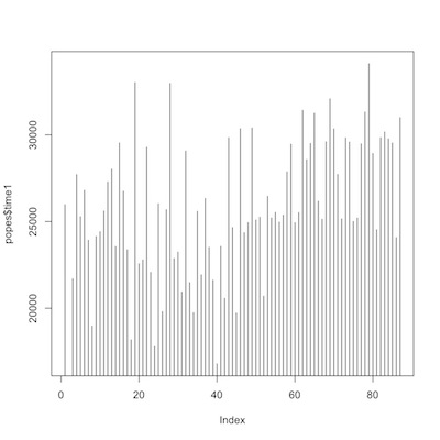
time from birth to death

time from election to death
Then a couple of plots of trends of time from birth to death, first overall, then comparing Romans to non-Romans.
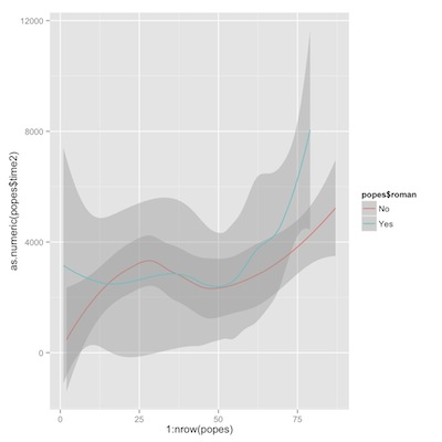
1 2 3 4 5 6 7 | library(ggplot2) p1<-ggplot(popes) p2<-p1+geom_line(aes(y=as.numeric(time1), x=1:nrow(popes))) p2+geom_smooth(aes(y=as.numeric(popes$time1), x=1:nrow(popes))) p1+geom_smooth(aes(y=as.numeric(popes$time1), x=1:nrow(popes), color=popes$roman)) |
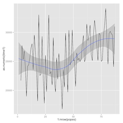
time from birth to death
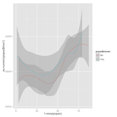
time from birth to death, romans vs. non-romans
Now similar plots for time from election to death.
1 2 3 4 | p3<-p1+geom_line(aes(y=as.numeric(time2), x=1:nrow(popes))) p3+geom_smooth(aes(y=as.numeric(popes$time2), x=1:nrow(popes))) p1+geom_smooth(aes(y=as.numeric(popes$time2), x=1:nrow(popes), color=popes$roman)) |
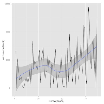
time from election to death
time from election to death, romans vs. non-romans
If we were analyzing these data in earnest, we would spend much more time on exploratory and descriptive analysis. But we can skip right to desert.
Survival analysis of the papal data
We have everything we need to do a survival analysis comparing Romans to non-Romans. We’ll look at both time from birth to death, then from election to death. (If you are unfamiliar with survival analysis, you can take a look at these slides)
1 2 3 4 5 6 7 8 9 10 11 12 13 14 | library(survival) pope.surv1<-Surv(as.numeric(popes$time1)) pope.surv2<-Surv(as.numeric(popes$time2)) km.pope.rom1<-survfit(pope.surv1~popes$roman) plot(km.pope.rom1, conf.int=T, col=c("black", "red")) survdiff(pope.surv1~popes$roman) km.pope.rom2<-survfit(pope.surv2~popes$roman) plot(km.pope.rom2, conf.int=T, col=c("black", "red")) survdiff(pope.surv2~popes$roman) |
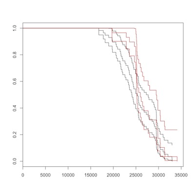
birth to death, romans (red) vs. non-romans
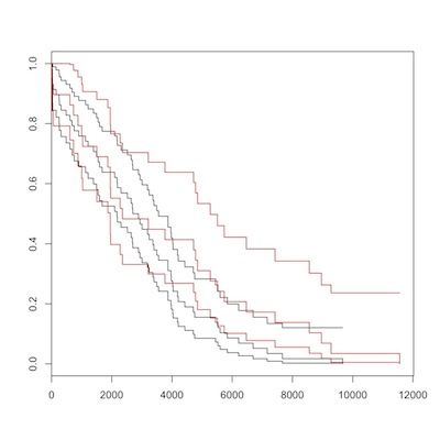
election to death, romans (red) vs. non-romans
There is no overall difference between Romans (in red) and non-Romans (black) for either overall, or post-election survival. Maybe you can convince yourself that non-Romans died at earlier ages, but the Logrank test from survdiff() should dissuade us of this. As Sherlock Holmes said, “There is nothing so tragic as a beautiful theory destroyed by an ugly fact.”
Analyzing Twitter Data
Social media like Facebook and Twitter are increasingly being put to public health use. Perhaps my favorite example is a recent CDC outbreak investigation of a Legionella-like illness at the Playboy mansion in Los Angeles. The following introduction to working with and mapping Twitter data come from is.R()
Searching for Twitter Posts
Begin by installing and loading the necessary packages. Note that the package RJSONIO was not necessary until just recently (due, I think to a change in the Twitter API) and is not mentioned in the post from which this tutorial came.
1 2 3 4 5 6 | library(twitteR) library(lubridate) library(RJSONIO) library(ggplot2) library(dismo) library(maps) |
Now that the tools are in place, let’s explore the “twitterverse” for health-related posts. Say we’re interested in tracking flu-like symptoms. Create some terms to search on Twitter, and set the names.
1 2 | searchTerms<-c("flu", "cold", "nausea", "vomiting", "headache") names(searchTerms)<-searchTerms |
The following code, applies the searchTwitter() function to the search terms and returns all tweets (up to a limit of 1,000) that contains any of those search terms.1
1 2 3 4 | searchResults<-lapply(searchTerms, function(tt){ print(tt) searchTwitter(searchString=tt, n=1000) }) |
Process and Plot Twitter Data
Use the twListToDF() function to convert the list of tweets to an R data frame.
1 | tweetFrames<-lapply(searchResults, twListToDF) |
The lubridate function ymd_hms() converts the timestamp for each tweet to a useful POSIX object.
1 2 3 4 | tweetFrames <- lapply(tweetFrames, function(df){ df$timeStamp <- ymd_hms(as.character(df$created)) return(df) }) |
A useful measure might be the the rate, or number of tweets per second. First count up the number of tweets in the data frame using nrow() Then, determine the time elapsed from the first tweet until the last. And calculate the rate.
1 2 3 4 5 6 7 8 9 | nTweets <- unlist(lapply(tweetFrames, function(df){ nrow(df) })) timeElapsed <- unlist(lapply(tweetFrames, function(df){ as.numeric(diff(range(df$timeStamp)), units = "secs") })) tweetsPerSec <- nTweets / timeElapsed |
Compare the “tweet rate” for each search term with a simple plot.
1 2 | plot(tweetsPerSec, type="h", frame.plot=FALSE, xaxt="n") axis(1, labels=names(tweetsPerSec), at=c(1:5)) |
We might like to plot the “tweet density” for each term. Use unclass() on the POSIX time stamp variable for each search term, which returns a numeric variable of the number of seconds since January 1, 1970. To center the values near zero, subtract 1,356,100,000 seconds. Combine the variables as a data frame.
1 2 3 4 5 6 | flu<-(unclass(tweetFrames$flu$timeStamp)-1356100000) cold<-(unclass(tweetFrames$cold$timeStamp)-1356100000) nausea<-(unclass(tweetFrames$nausea$timeStamp)-1356100000) vomiting<-(unclass(tweetFrames$vomiting$timeStamp)-1356100000) headache<-(unclass(tweetFrames$headache$timeStamp)-1356100000) ddf<-data.frame(cbind(flu, cold, nausea, vomiting, headache)) |
To create a plot of all the variables on one graph in ggplot2, convert the “wide” data frame to a “long” data frame. Assign the ggplot parameters to an object, and request a density geometry.
1 2 3 4 | ddf.s<-stack(ddf) p<-ggplot(ddf.s, aes(x=values)) p+geom_density(aes(group=ind, color=ind, fill=ind), alpha=0.3)+xlim(70000,83000) |
Mapping Twitter Data
Many, but not all, Twitter posts can be linked to a user’s geographic location. This tutorial, also from is.R()) walks through the process of extracting georeferenced data from twitter posts, and creating a simple map.
We start as we did above, only this time, we search for the hash-tag term for whooping cough, established as a means of surveillance by (I think) CDC. We gather the tweets with searchTwitter(), and convert the results to a data frame.
1 2 3 | searchTerm <- "#whoopingcough" searchResults <- searchTwitter(searchTerm, n = 1000) tweetFrame <- twListToDF(searchResults) |
We use the lookupUsers() function in twitteR to batch look up user information. which we, again, convert to a data frame.
1 2 | userInfo <- lookupUsers(tweetFrame$screenName) userFrame <- twListToDF(userInfo) |
We restrict the results to only those users with valid location information.
1 | locatedUsers <- !is.na(userFrame$location) |
The next bit of code uses the geocode() function in the dismo package to guess the approximate latitude and longitude from the text location data.
1 | locations <- geocode(userFrame$location[locatedUsers]) |
Latitude and longitude are simply numbers referenced in an easterly and northerly direction, so we can plot them as they are.
1 | plot(locations$lon, locations$lat) |
But, it is clearly better to create a “real” spatial plot. First extract a world map from the maps package.
{.r .numberLines} worldMap <- map_data("world") Build up a map in ggplot, step by step. Note that ggplot play nicely with the map package.
Draw the map
1 2 3 | p1 <- ggplot(worldMap) p2 <- p1 + geom_path(aes(x = long, y = lat, group = group), colour = gray(2/3), lwd = 1/3) |
Add the twitter post locations.
1 2 3 4 | p3 <- p2 + geom_point(data = locations, aes(x = lon, y = lat), colour = "RED", alpha = 1/2, size = 1) print(p3) |
You can easily change projections or themes
1 2 | p3+coord_equal() p3+theme_bw() |
Or limit the map to eastern North America.
1 2 | p3+scale_x_continuous(limits=c(-100,-50)) +scale_y_continuous(limits=c(25,50)) |
More resources
Here are some more advanced examples using readLine, scraping sites like Google Scholar, and Facebook, getting information from search sites, and even crunching numbers to buy a used car.
Often enough, data and text documents on websites are in pdf format. The following approach to parsing pdf documents in R from Felix Schonbrodt might come in handy. It is mac-specific, but you should be able to adapt it or track down an approach for PCs.
Enjoy
I haven’t explored this thoroughly yet, but I believe the limit of 1,000 is again related to the restrictions of the Twitter API.↩